Appearance
Components
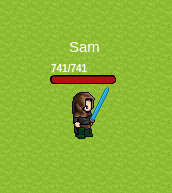
The aim is to add components around the graphic: a text, a life bar, etc. This way, the server always has authority over the display and all data is synchronised to all players in real time
Example of use:
ts
import { RpgPlayer, RpgPlayerHooks, Components } from '@rpgjs/server'

export const player: RpgPlayerHooks = {
    onConnected(player: RpgPlayer) {
        player.name = 'Sam'
        player.setComponentsTop<any>([
            Components.text('{name}'),
            Components.hpBar()
        ])
    }
}
The onConnected hook takes a player object of type RpgPlayer as its argument. Inside the onConnected hook, the setComponentsTop method of the player object is called with an array of two Components:
Components.text('{name}'): This creates a text component that displays the name of the player. The {name} placeholder is replaced with the actual name of the player.
Components.hpBar(): This creates a health bar component that displays the current and maximum health of the player.
The setComponentsTop method is used to set the components that are displayed at the top of the player's screen. By setting the text and health bar components at the top, the player can easily see their name and health status while playing the game.
Player API
Summary
Set Graphic
- Method:
player.setGraphic(graphic) - Arguments:
- {
string | number | (string | number)[]}graphic. (Optional:false)
- {
- Return:
void - Usage:
Give the spritesheet identifier
Since version 3.0.0-rc, you can define several graphic elements. If you put a number, it represents the tile ID in the tileset
Example 1:
ts
player.setGraphic(['body', 'shield'])Example 2:
ts
player.setGraphic(3) // Use tile #3You must, on the client side, create the spritesheet in question. Guide: Create Sprite
Remove Components
- Since: 3.3.0
- Arguments:
- {
string}position. Position of the components. Can be:top,center,bottom,left,right(Optional:false)
- {
- Usage:
Delete components
Merge Components
- Since: 3.3.0
- Arguments:
- {
string}position. Position of the components. Can be:top,center,bottom,left,right(Optional:false) - {
Object}layout. (Optional:false) - {
Object}options. (Optional:false)
- {
- Usage:
Merges components with existing components
For use layout and options, see setComponentsTop
Set Components Center
- Since: 3.3.0
- Method:
player.setComponentsCenter(layout,options) - Arguments:
- {
Object}layout. (Optional:false) - {
Object}options. (Optional:false)
- {
- Usage:
Add components to the center of the graphic.
View setComponentsTop for more information
Be careful, because if you assign, it deletes the graphics and if the lines are superimposed (unlike the other locations)
Set Components Top
- Since: 3.3.0
- Method:
player.setComponentsTop(layout,options) - Arguments:
- {
ComponentObject[][] | ComponentObject[] | ComponentObject}layout. Components (Optional:false) - {
Object}options. Options (Optional:true) - {
number}options.width. Width of the block (Optional:true) - {
number}options.height. Height of the block (Optional:true) - {
number}options.marginTop. Margin top (Optional:true) - {
number}options.marginBottom. Margin bottom (Optional:true) - {
number}options.marginLeft. Margin left (Optional:true) - {
number}options.marginRight. Margin right (Optional:true)
- {
- Usage:
Add components to the top of the graphic. e.g. text, life bar etc. The block will be centred The first array corresponds to the rows, and the nested table to the array in the row
Example:
ts
import { Components } from '@rpgjs/server'

player.setComponentsTop([
     [Components.text('Hello World')],
     [Components.hpBar()]
]) // 2 lines with 1 component each
or
ts
import { Components } from '@rpgjs/server'

player.setComponentsTop([
     [Components.text('Hello World'), Components.hpBar()]
]) // 1 line with 2 components
You can be faster if you only have lines
ts
player.setComponentsTop([
     Components.text('Hello World'),
     Components.hpBar()
]) // 2 lines with 1 component each
or one component:
ts
player.setComponentsTop(Components.text('Hello World')) // 1 line with 1 componentYou can add options to manage the style
ts
player.setComponentsTop([
     Components.text('Hello World'),
     Components.hpBar()
], {
     width: 100,
     height: 20,
     marginTop: 10,
})
Set Components Bottom
- Since: 3.3.0
- Method:
player.setComponentsBottom(layout,options) - Arguments:
- {
Object}layout. (Optional:false) - {
Object}options. (Optional:false)
- {
- Usage:
Add components to the bottom of the graphic.
View setComponentsTop for more information
Set Components Left
- Since: 3.3.0
- Method:
player.setComponentsLeft(layout,options) - Arguments:
- {
Object}layout. (Optional:false) - {
Object}options. (Optional:false)
- {
- Usage:
Add components to the left of the graphic.
View setComponentsTop for more information
Set Components Right
- Since: 3.3.0
- Method:
player.setComponentsRight(layout,options) - Arguments:
- {
Object}layout. (Optional:false) - {
Object}options. (Optional:false)
- {
- Usage:
Add components to the right of the graphic.
View setComponentsTop for more information
Built-in Components
Summary
Bar Component
- Since: 3.3.0
- Arguments:
- {
string}current. Parameter that corresponds to the current value (Optional:false) - {
string}max. Parameter that corresponds to the maximum value (Optional:false) - {
object}style. style (Optional:true) - {
string}style.bgColor. background color. Hexadecimal format. (Optional:true) - {
string}style.fillColor. fill color. Hexadecimal format. (Optional:true) - {
string}style.borderColor. border color. Hexadecimal format. (Optional:true) - {
number}style.borderWidth. border width (Optional:true) - {
number}style.height. height (Optional:true) - {
number}style.width. width (Optional:true) - {
number}style.borderRadius. border radius (Optional:true) - {
number}style.opacity. opacity (Optional:true) - {
string | null}text. text above bar. if null, no text will be displayed. You can use the variables (Optional:true)
- {
- Return:
BarComponentObject - Usage:
Displays a bar
Example:
ts
import { Components } from '@rpgjs/server'
Components.bar('hp', 'param.maxHp', {
   bgColor: '#ab0606'
})
For text, you can use the following variables:
- {$current} current value
- {$max} maximum value
- {$percent} percentage
Example:
ts
import { Components } from '@rpgjs/server'
Components.bar('hp', 'param.maxHp', {
  bgColor: '#ab0606'
}, 'HP: {$current}/{$max}')
and you can also use the variables of player:
ts
import { Components } from '@rpgjs/server'
Components.bar('hp', 'param.maxHp', {
 bgColor: '#ab0606'
}, 'HP: {$current}/{$max} - {name}') // HP: 100/100 - John
HP Bar Component
- Since: 3.3.0
- Arguments:
- {
object}style. style. See bar style (Components.bar()) (Optional:true) - {
string | null}text. test above bar (Components.bar()) (Optional:true)
- {
- Return:
BarComponentObject - Usage:
Displays a life bar
SP Bar Component
- Since: 3.3.0
- Arguments:
- {
object}style. style. See bar style (Components.bar()) (Optional:true) - {
string | null}text. test above bar (Components.bar()) (Optional:true)
- {
- Return:
BarComponentObject - Usage:
Displays a SP bar
Text Component
- Since: 3.3.0
- Arguments:
- {
string}value. source (Optional:false) - {
object}style. style (Optional:true) - {
string}style.fill. color. Hexadecimal format. (Optional:true) - {
number}style.fontSize. font size (Optional:true) - {
string}style.fontFamily. font family (Optional:true) - {
string}style.stroke. stroke color. Hexadecimal format. (Optional:true) - {<Type type=''normal' | 'italic' | 'oblique'' />}
style.fontStyle. font style (Optional:true) - {<Type type=''normal' | 'bold' | 'bolder' | 'lighter' | '100' | '200' | '300' | '400' | '500' | '600' | '700' | '800' | '900'' />}
style.fontWeight. font weight (Optional:true) - {
number}style.opacity. opacity. Between 0 and 1 (Optional:true) - {
boolean}style.wordWrap. word wrap (Optional:true) - {<Type type=''left' | 'center' | 'right' | 'justify'' />}
style.align. align (Optional:true)
- {
- Return:
TextComponentObject - Usage:
Put on the text. You can read the content of a variable with {} format (see example below)
Example:
ts
import { Components } from '@rpgjs/server'
Components.text('Hello World')
Example with variable:
ts
import { Components } from '@rpgjs/server'
Components.text('{name}')
Other example with position:
ts
import { Components } from '@rpgjs/server'
Components.text('X: {position.x} Y: {position.y}')
With style:
ts
import { Components } from '@rpgjs/server'
Components.text('Hello World', {
     fill: '#ffffff',
     fontSize: 20,
     fontFamily: 'Arial',
     stroke: '#000000',
     fontStyle: 'italic',
     fontWeight: 'bold'
})
Shape Component
- Since: 3.3.0
- Arguments:
- {
object}value. (Optional:false) - {
string}value.fill. color. Hexadecimal format. (Optional:false) - {
number | string}value.opacity. opacity. Between 0 and 1 (Optional:true) - {
string}value.type. type of shape. Can be 'circle' or 'rectangle', 'ellipse' or 'polygon', 'line' or 'rounded-rectangle' (Optional:false) - {
number | string}value.radius. if type is circle, radius of the circle (Optional:true) - {
number | string}value.width. if type is rectangle or ellipse, width of the rectangle (Optional:true) - {
number | string}value.height. if type is rectangle or ellipse, height of the rectangle (Optional:true) - {
number | string}value.x1. if type is line, x1 position of the line (Optional:true) - {
number | string}value.y1. if type is line, y1 position of the line (Optional:true) - {
number | string}value.x2. if type is line, x2 position of the line (Optional:true) - {
number | string}value.y2. if type is line, y2 position of the line (Optional:true) - {
number[]}value.points. if type is polygon, points of the polygon (Optional:true) - {
object}value.line. border style (Optional:true) - {
string}value.line.color. border color. Hexadecimal format. (Optional:true) - {
number}value.line.width. border width (Optional:true) - {
number}value.line.alpha. border opacity. Between 0 and 1 (Optional:true)
- {
- Return:
ShapeComponentObject - Usage:
Add a shape
Example:
ts
import { Components } from '@rpgjs/server'
Components.shape({
     fill: '#ffffff',
     type: 'circle',
     radius: 10
})
You can use parameters:
ts
import { Components } from '@rpgjs/server'
Components.shape({
     fill: '#ffffff',
     type: 'circle',
     radius: 'hp'
})
Here, the radius will be the same as the hp value
Image Component
- Since: 3.3.0
- Arguments:
- {
string}value. source (Optional:false)
- {
- Return:
ImageComponentObject - Usage:
Put the link to an image or the identifier of an image (if the spritesheet exists)
Example:
ts
import { Components } from '@rpgjs/server'
Components.image('mygraphic.png')
Tile Component
- Since: 3.3.0
- Arguments:
- {
number}value. tile ID (Optional:false)
- {
- Return:
TileComponentObject - Usage:
Indicates the tile ID
Example:
ts
import { Components } from '@rpgjs/server'
Components.tile(3)